Wednesday, August 26, 2020

Design Studio Press publishes various art books, tutorials and profiles of the works by artist such as Scott Robertson, Nathaniel Fowkes and Simon StÃ¥lenhag arthur of Tales from the Loop and many more.
https://designstudiopress.com/

Their link page is packed  with links to artists, various forum, schools and concept design artists.


You can follow on Facebook or their Instagram page for more insight .

welcome to design studio press

Design Studio Press is a Southern California–based publishing house with its fingers on the pulse of concept design. Founded over a decade ago by Scott Robertson, the press has stayed true to its mission to feature and partner directly with artists. With almost 100 titles and approximately 12 new ones released every year, Design Studio Press brings international attention to the field of concept art and educates future generations by publishing art and tutorials by world-renowned entertainment designers.


I have always admired Michelangelo from my high school days to today. This article is from The Getty on line, the original link is provided.

https://www.getty.edu/art/exhibitions/michelangelo_drawings/explore.html?utm_source=facebook&utm_medium=PaidSocial&utm_campaign=Michelangelo%3A+Mind+of+the+Master_Art+Lovers

Michelangelo: Mind of the Master

Sculptor. Painter. Architect.

Michelangelo Buonarroti is recognized as one of the most creative and influential artists in the history of Western art. His most celebrated creations have become icons of world culture: the monumental marble David in Florence; the astonishing frescoes in the Sistine Chapel and the soaring dome of Saint Peter’s Basilica, both in Rome.

Michelangelo was active mainly in Florence and Rome, two major cultural and political centers in fifteenth- and sixteenth-century Europe. He received the support of important patrons, including members of the ruling Medici family of Florence and, for a crucial decade, the leader of the Roman Catholic Church, Julius II. His creations were revered and coveted particularly for their ingenious compositions and their powerful representation of the muscular human body.

Drawing was key to Michelangelo’s practice. This exhibition explores the full range of his work through a selection of his rare preparatory drawings, from compositional sketches to detailed figure studies. The works span the arc of Michelangelo’s long life—he died at the age of eighty-eight—and give unparalleled insight into his artistic invention and achievements.

Michelangelo and His Drawings

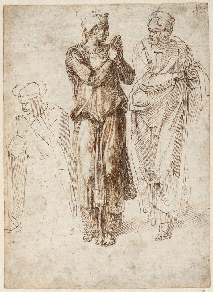
Three Draped Figures with Clasped Hands, 1496–1503, Michelangelo Buonarroti, pen and two shades of brown ink over traces of black chalk. Teylers Museum, Haarlem. Purchased in 1790. © Teylers Museum, Haarlem

For Michelangelo, drawing was a fundamental, lifelong activity. When he was a student, it helped him learn from other artists’ work; thereafter drawing was a tool he used to capture reality and the conceptions of his imagination. Consistently dedicated to drawing the human figure from life, a growing practice in Florentine artists’ studios at the time, Michelangelo took this to a new level of verisimilitude through keen observation, as well as by studying dissected corpses to better understand the underlying muscles.

Early in his career Michelangelo drew mainly in pen and ink, but he soon came to appreciate the convenience and effectiveness of naturally mined chalk. He used both red and black colors, preferring the latter as time went on.

Today, as through history, Michelangelo’s drawings are valued not only as works exhibiting extraordinary skill but as windows into the mind of the master. They let us witness—in an astonishingly direct and intimate way—the creation of some of the greatest works of Renaissance art.

The Battle of Cascina

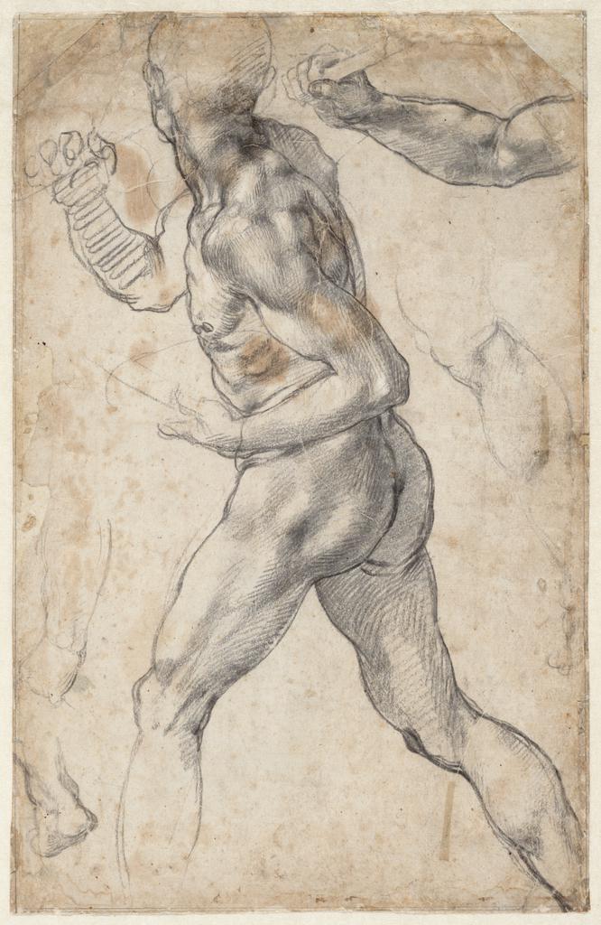
Striding Male Nude, and Anatomical Details, 1504 or 1506, Michelangelo Buonarroti, black chalk with white heightening. Teylers Museum, Haarlem. Purchased in 1790. © Teylers Museum, Haarlem

In the summer of 1504, Michelangelo was commissioned to paint the Battle of Cascina on one wall of the Sala del Gran Consiglio (Great Council Chamber) in the Palazzo della Signoria, Florence. The commission brought Michelangelo into direct competition with Leonardo da Vinci, who had been contracted to paint the Battle of Anghiari on the opposite wall a year earlier. Both murals would commemorate famous battles in Florentine history. Although the artists made full-scale drawings (called "cartoons") of parts of their compositions, the works themselves were never completed. The large cartoons, celebrated and constantly studied, eventually fell apart from handling by overzealous copyists.

The copy of Michelangelo’s cartoon by Bastiano da Sangallo, reproduced here, records the composition with its life-size figures. For his scene Michelangelo focused the action on a moment before the battle when Florentine soldiers were surprised by enemy forces as they bathed in the river Arno. The idea played to Michelangelo’s strength in rendering the human figure and cemented his role as the prime pioneering draftsman of the heroic male nude. Two rare surviving preparatory drawings for Michelangelo’s famed cartoon are shown nearby; these were revolutionary for the period in their relatively large scale and naturalistic precision.

Michelangelo and Anatomy

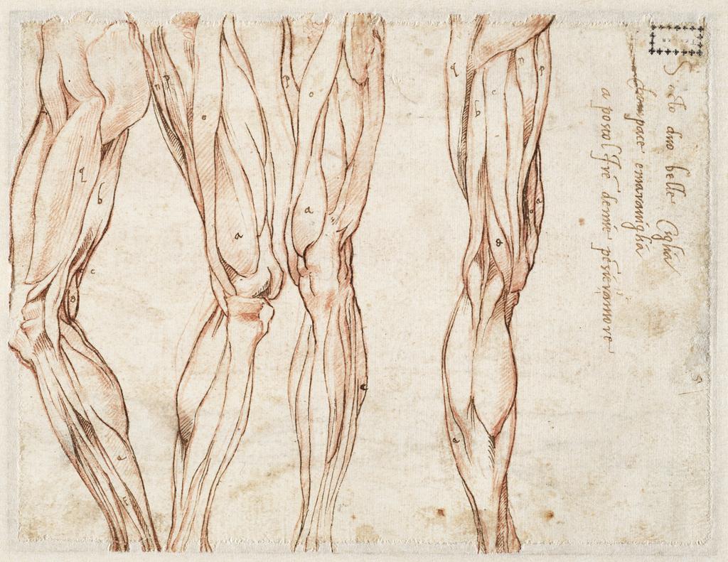
Four Studies of a Left Leg, 1515–20, Michelangelo Buonarroti, red chalk, retraced with pen and brown ink. Teylers Museum, Haarlem. Purchased in 1790. © Teylers Museum, Haarlem

Unlike most Renaissance artists, who learned about the human body from ancient sculpture and live models, Michelangelo participated in dissections. According to his acquaintance and biographer Ascanio Condivi, the artist first examined corpses in the convent of Santo Spirito in Florence when he was in his late teens.

Michelangelo’s interest in anatomy did not extend to the organs but focused on the muscles and bones. His surviving anatomical drawings, like the ones exhibited here, attest to his thorough understanding of certain muscles, especially those of the limbs. The dissections enabled Michelangelo to grasp how the surface and contour of the body change when one moves. This knowledge was crucial for the creation of his renowned heroic nudes.

San Lorenzo, Florence

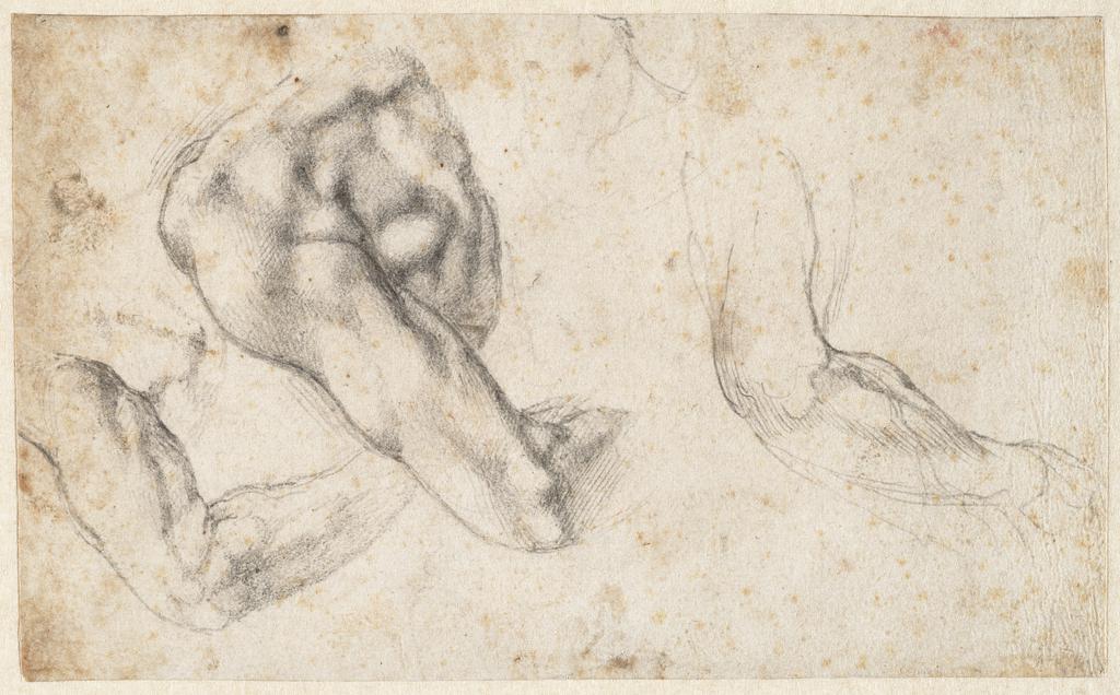
Three Studies of a Left Arm and Shoulder, Seen from the Back, 1523–24, Michelangelo Buonarroti, black chalk. Teylers Museum, Haarlem. Purchased in 1790. © Teylers Museum, Haarlem

During the 1510s and 1520s the ruling Medici family of Florence sought Michelangelo’s talents to aggrandize themselves and commemorate their power and legacy. Two Medici popes—Leo X (Giovanni di Lorenzo de’ Medici) and Clement VII (Giulio de’ Medici)—provided Michelangelo with commissions centered on the family’s parish church, the Basilica of San Lorenzo in Florence. Michelangelo designed the architectural and sculptural elements for a New Sacristy, housing tombs of family members, and for the Laurentian Library (named for Lorenzo de’ Medici), adjacent to the church. The tomb of Giuliano de’ Medici, Duke of Nemours was to be adorned with reclining statues representing Night and Day. Very few of Michelangelo’s drawings for sculpture survive, but four sheets related to Day offer rare insight into Michelangelo’s careful preparations on paper before taking his chisel to the marble block.

Two and Three Dimensions

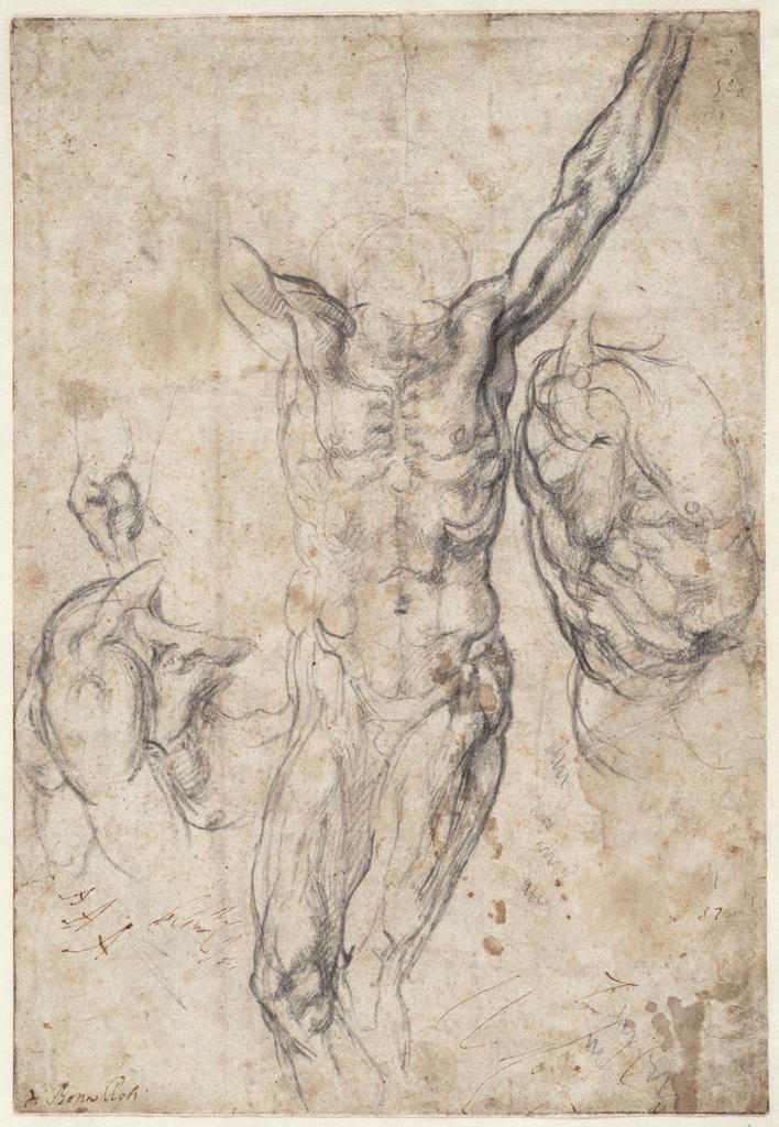
Four Studies, Including Two for a Crucified Figure, 1530–34, Michelangelo Buonarroti, black chalk. Teylers Museum, Haarlem. Purchased in 1790. © Teylers Museum, Haarlem

In his artistic practice, Michelangelo used drawings for designing both two- and three-dimensional objects. But he approached his task differently when working toward a painting rather than a sculpture or an architectural structure.

In the case of two-dimensional projects, Michelangelo relied exclusively on drawings in the design process. He worked out the composition through a sequence of sketches and studies. After he finalized the design, he transferred it with the help of a cartoon, a full-scale pricked drawing. In the case of three-dimensional projects, drawings allowed him to explore only one view at a time. Therefore, Michelangelo often drew the same form from various angles and introduced models made of clay, wax, or wood into his process, which enabled him to test his ideas in space.

The Sistine Chapel Ceiling

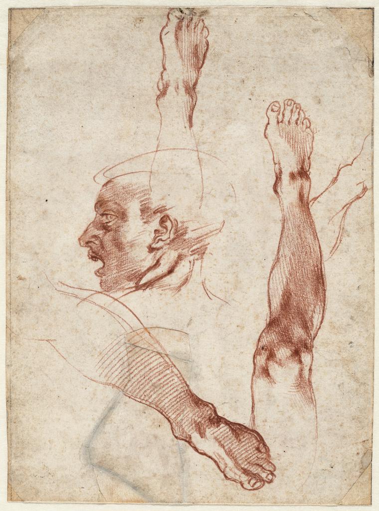
Male Head in Profile; Studies of Legs and Feet, 1511, Michelangelo Buonarroti, red chalk. Teylers Museum, Haarlem. Purchased in 1790. © Teylers Museum, Haarlem

The Sistine Chapel was constructed between 1473 and 1481 for Pope Sixtus IV as the pope’s private chapel. It has served as the site for important papal ceremonies and the meeting place of the Sacred College of Cardinals.

The dazzling complexity, beauty, and achievement of Michelangelo’s frescoes on the ceiling of the Sistine Chapel in Rome still astonish visitors more than five hundred years after they were painted. The project took Michelangelo just four years— remarkable given that it comprised over 5,700 square feet of labor-intensive fresco painting, all completed by the artist himself, with only the most menial of preparatory tasks delegated to assistants.

The commission to paint scenes from the biblical book of Genesis came from Pope Julius II in April–May 1508. The numerous illusionistic compartments also included alternating prophets and sybils (female prophets). Prominent images of athletic male nudes (ignudi) flank the principal narrative panels. Michelangelo worked standing up, his brush held above his head, paint and debris falling into his face. He relied on lamps since scaffolding blocked much of the natural light from the windows.

Michelangelo completed the commission in two sessions. When the scaffolding from the first half was taken down in the summer of 1511, he had a chance to see the result from the floor, and in the speedily completed second half (toward the altar) he made the figures larger and the compositions clearer.

The drawings for the Sistine Ceiling shown here are among the few that survive. Michelangelo burned the vast majority so that no one, according to the artist-biographer Giorgio Vasari, could see his creative struggles.

The Last Judgment

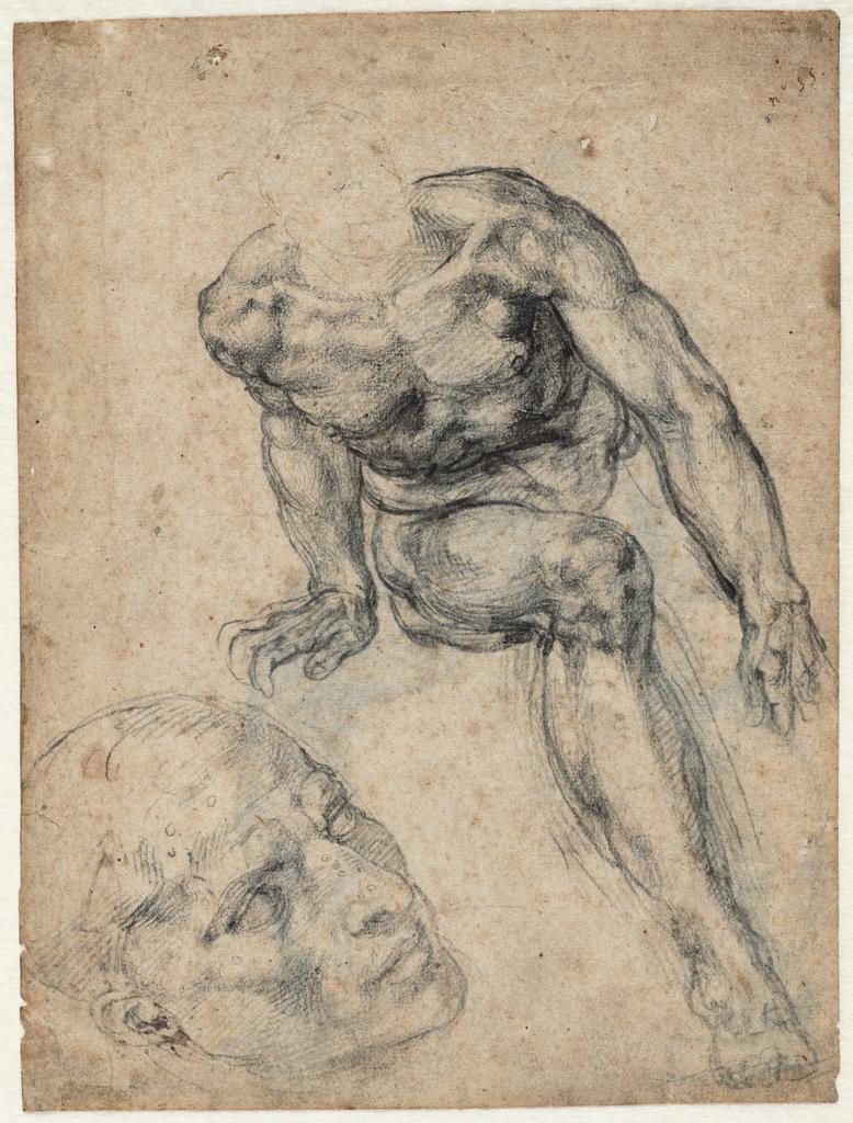
A Male Nude; Separate Study of His Head, about 1537–38, Michelangelo Buonarroti, black chalk. Teylers Museum, Haarlem. Purchased in 1790. © Teylers Museum, Haarlem

In 1533 Michelangelo received a second commission for the Sistine Chapel, this time from Pope Clement VII: a huge fresco of the Last Judgment above the altar. The artist completed it in 1541. Although the Last Judgment was a standard subject in Christian iconography, showing the moment in Christian belief when God sits in judgment of humankind, Michelangelo’s version was unorthodox. A bare-chested Christ presides in the middle of the composition, surrounded by mostly nude saints, while the saved rise to heaven and the damned descend to hell. The pervasive nudity caused immediate controversy within the Catholic Church, and in 1563 orders were given to cover some of the exposed flesh with carefully placed drapery. Daniele da Volterra did the overpainting in 1565, soon after Michelangelo’s death. Nevertheless, Michelangelo’s lifelong focus on the depiction of the human body reached its zenith in the Last Judgment, and the fresco was revered by later generations of artists.

Michelangelo and the New Saint Peter’s Basilica

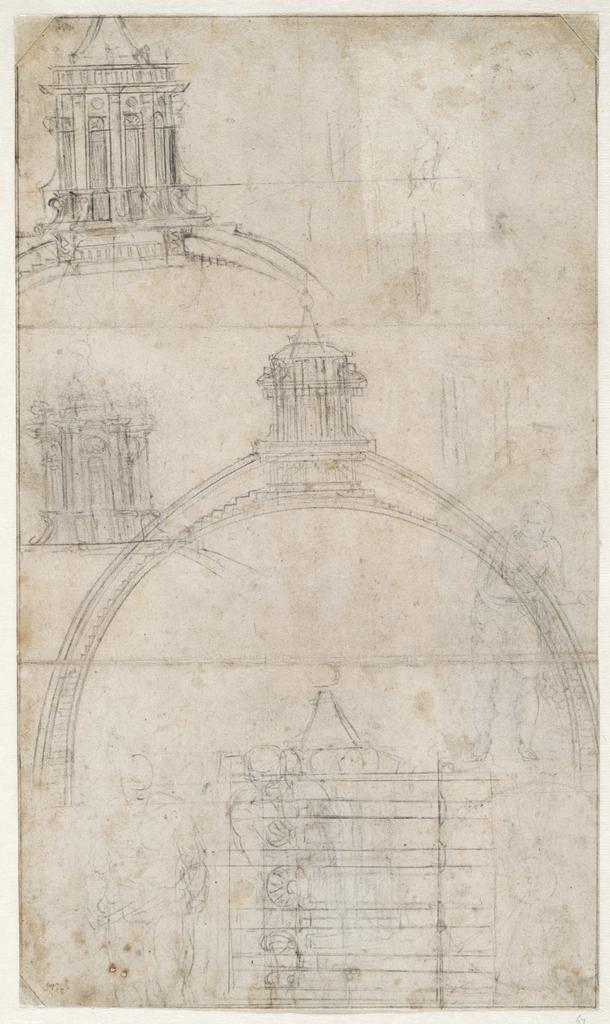
Section through the Dome of Saint Peter’s Basilica with Alternative Designs for the Lantern; Figure Sketches, 1547–61, Michelangelo Buonarroti, black chalk, leadpoint, and stylus. Teylers Museum, Haarlem. Purchased in 1790. © Teylers Museum, Haarlem

Following the death of the architect Antonio da Sangallo in 1546, Pope Paul III put Michelangelo in charge of construction of the new Saint Peter’s Basilica, the seat of the Roman Catholic Church. The pope entrusted the artist with this highly prestigious project despite his limited experience as an architect.

The principal challenge that Michelangelo faced was designing a grand dome over the church crossing (where the transept intersects the nave). He employed both drawings and three-dimensional models to explore his ideas and convey them to others. Because of the project’s magnitude and complexity, Michelangelo did not live to see the finished dome; only the drum was near completion when he died in 1564.

Destruction, Survival, Appreciation

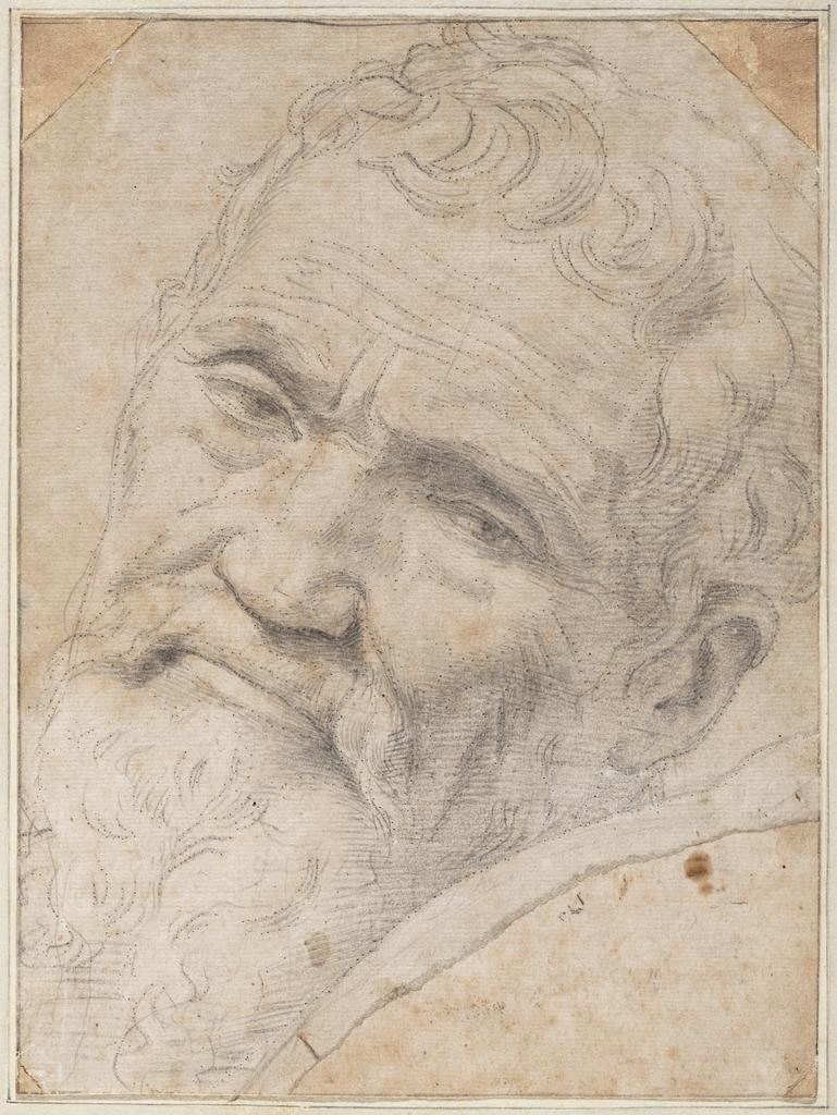
Portrait of Michelangelo Buonarroti, about 1550–51, Daniele da Volterra (Daniele Ricciarelli), leadpoint and black chalk with traces of white heightening; outlines pricked for transfer. Teylers Museum, Haarlem. Purchased in 1790. © Teylers Museum, Haarlem

Protective of his ideas and deeply distrustful of even those close to him, Michelangelo burned large quantities of his drawings over the course of his life. When he died in Rome on February 18, 1564, just five figure drawings and five architectural sheets were found in his home, locked in a walnut chest protected with wax seals. More remained at his house in Florence, but they were still only a fraction of those he produced. It has been estimated that if Michelangelo drew just a single sheet every day of his long working life, he would have made about twenty-eight thousand drawings. We currently know of only about six hundred. A group of the very finest is on display here now.

Sunday, May 26, 2013

Latest drawings and painnting

I've been a little busy: Trying to be productive - but from my perspective -Never Enough


Saturday, June 23, 2012

Richard Diebenkorn

Re-print of a blog from word press blogger Mario Muller  his blog: Truffle Hunting: Fine Art Experiences of Quality and Resonance
http://trufflehunting.wordpress.com/

Read about him to learn more on who he is.

Richard Diebenkorn, Iconoclast

May 4, 2012
Let’s cut to the chase. Richard Diebenkorn is an artist of supreme soulful significance. Any opportunity to submerge oneself in his luxuriating hues and intelligent compositions should be immediately embraced. The chance to see an exhibition of 75 paintings, drawings and prints is nothing less than a must see moment.

Richard Diebenkorn Ocean Park #79, 1975 Oil on canvas 93 x 81 in. (236.2 x 205.7 cm) Philadelphia Museum of Art, Purchased with a grant from the National Endowment for the Arts and with funds contributed by private donors, 1977
©The Estate of Richard Diebenkorn Image courtesy the Philadelphia Museum of Art
The Orange County Museum of Art in Newport Beach is featuring just such a Diebenkorn exhibition. The show draws it’s focus on the extensive Ocean Park series, begun in 1967 and extending to the artist’s death in 1993. Thoughtfully curated by OCMA’s Sarah C. Bancroft, the exhibition succeeds in numerous ways. The scale is pitch perfect offering an authoritative overview without becoming exhaustive. The balance of media on display also offers a marvelous opportunity to see both the trajectory of Diebenkorn’s compositional investigation and his encyclopedic skills as an artist. And by offering three entry doors, the exhibition affords several paths for discovery, none of which is wrong, and all of which lead to different conclusions, epiphanies and insights.
My appreciation of Diebenkorn’s entire oeuvre is indisputable. Long before Gerhard Richter, he practiced a harmonious both/and paradigm between abstraction and interprative realism. He proved that geometric compositional distillation and expressive mark-making were symbiotic. This interdependence remains difficult for many to embrace. Briefly, and in non-sequential order, here are several musings on Diebenkorn and the excellent Ocean Park Exhibition.

Richard Diebenkorn Cigar Box Lid #4, 1976 Oil on wood 8 3/8 x 7 1/8 in. and Ocean Park #105, 1978 Oil and charcoal on canvas 100 1/8 x 93 1/8 in.
Scale. Diebenkorn is equally facile in small, medium and grand scale painting and drawing. The exhibit contains numerous examples of painted Cigar Box tops that carry the same heroic weight as their 100 by 93 inch counterparts. Gestures physically made with fingertips and wrist have the bravado as brushstrokes executed with elbow and shoulder. And conversely, large brushstrokes carry the same delicacy and nuance as their miniature cousins.
Intentionality. Diebenkorn exerts enormous control over every aesthetic decision. There are drips and stains and bleedthroughs but each seems intentional and executed to a greater purpose. This dialogue with accident and the painting’s trajectory of push and pull is inspiring to study in one painting let alone 75!

Richard Diebenkorn Ocean Park #43, 1971 Oil and charcoal on canvas 93 x 81 in. (236.2 x 205.7 cm) Collection of Gretchen and John Berggruen, San Francisco
©The Estate of Richard Diebenkorn Image courtesy the Estate of Richard Diebenkorn
Optical Pleasure. Dienbenkon’s color palette is unapologetically beautiful. Lush and vibrant, underpainting permeates every endeavor. This optical mixing of colors through layering and glazing techniques presents an art that is collaborative with every viewer’s optical capacity.
Light and Shadow. Figure and Ground. Line and Volume. These, and countless other polarities, are constantly dancing, switching and folding unto each other. Diebenkorn thusly acts as a choreographer and the picture plane is the proscenium stage on which this narrative boogie woogie reveals itself.
And then there’s Matisse. It helps alot to know even a modicum of Matisse to see what drove Diebenkorn. The Orange County exhibition bears the unmistakable heartbeat of Matisse throughout each gallery. While this might not be a new scholarly insight, it’s nonetheless valuable to see the mantle that Diebenkorn was willing tackle. It further cements the historical trajectory that proves Diebenkorn essential, indispensible and heroic.

Richard Diebenkorn Untitled (Ocean Park), 1971 Charcoal on paper 26 1/4 x 18 5/8 inches Henri Matisse View of Notre Dame, 1914, Oil on Canvas 58 x 37 inches
Take for instance this lovely diptych of an Ocean Park Charcoal and Matisse’s View of Notre Dame from 1914. The perspectival lines creating an optical entrance to the picture plane act in similar ways. Contrast, if you will, the use of the single arch in a sea of straight lines. Erasures and adjustments abound further accentuating the process of the artist’s every gesture. The act of compositional decision-making is the subject matter and we are drawn (pun intended) into the unfolding drama.

Henri Matisse The Piano Lesson 1916. Oil on canvas, 8′ 1/2″ x 6′ 11 3/4″ & Richard Diebenkorn Ocean Park #16, 1968 Oil on canvas 92 1/2 x 76 in.
Both Matisse and Diebenkorn harnessed the push/pull eccentricities of color. The greens and pinks extend forward while the unending variations of grays recede. In the hands of these masters depth becomes not simply a definition of physical space but a corporeal experience of picture plane; an on-ramp, if you will, where you visually go from 0-60 in 2.2 seconds.

Henri Matisse, Open Window, Collioure, 1905 and Richard Diebenkorn Blue Surround, 1982
Windows open into a room while simultaneously defining the space outside. Thus, infinity is defined by enclosure.
Richard Diebenkorn: The Ocean Park Series continues through May 27th at the Orange County Museum of Art. From there it travels to its final destination of the Corcoran Gallery in Washington D.C. where it opens June 30th, 2012. For all that is holy, see this show!
Update June 6th, 2012: While I’m not generally a fan of the Huffington Post, there is a nice conversational piece about Diebenkorn and the run of the exhibition at OCMA. Link Here!
-Mario M. Muller, Los Angeles, May 4th, 2012

Monday, May 21, 2012

2012 commitment to draw - paint-sketrch

This weekend I got my garden in - downsized. Mary is going to retire. My daughter got the teaching job she was hoping to get. My two boys are doing great... Nick travels frequently for work. Steve is doing fantastic with his sales position.
I started this primarily to openly commit to more drawing, sketching and painting. I am pretty sure I can double what I did last year and add a series of oils or acrylics.

I am alway impressed with Nathan Fawkes' Landsketch blog. Simply awesome stuff, what an eye he has for light and dark. Compositions and gesture paintings so freely done so creative.


Tuesday, May 8, 2012

Urban Sketchers: Incident at Lady Meredith - Workshops on my mind! posted by Marc Holmes on Urban Sktecher

Urban Sketchers: Incident at Lady Meredith - Workshops on my mind!: The last couple days I've been out painting Lady Meredith House , at the corner of Pins and Peel, in the heart of the Golden Mile. I pass ...


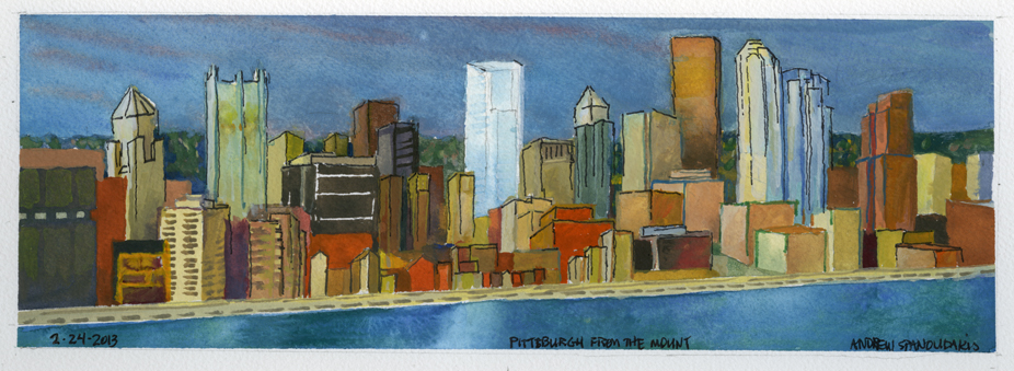
Spring is here, the weather is getting nice . Clearly time to get back outside and paint more of the city-river series.

Thursday, April 26, 2012

Animation subtle simple

Markus-Weldon copied from Deviant Art Very niceFly - Markus Weldon

Sunday, April 22, 2012

March / April sketches


Drawings from March of this year. So many changes a year brings in our lives. People, events, frustrations, disappointments. Joys, pleasure, successes, happiness, confidence. hoping for a productive year as I start planning for retirement in either a year or two. Or maybe not at all if the environment improves. 

More drawings and paintings to come. UrbanSketcher

Sunday, January 8, 2012

Flame art

Nice video